Flutter allows one to create beautiful websites and all, but there is one flaw that the initial loading time, it takes is huge (1~2 seconds). This time allows android and iOS apps to show SplashScreens, but there is no such thing for websites. So today, I will show you an easy way to quickly add a CSS loader to your website.
Getting Started
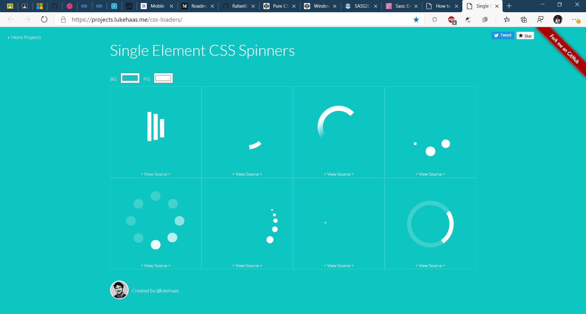
First make sure that you have a prebuilt website on which you want to apply this effect. Building a website in Flutter is very easy and you can search for various tutorials online for it. Then you need to make or search for the CSS Loader that you want to use. Here are some website that you can use to find one -
I will be going to use the second one.

Step-2 Importing the loader
To import the loader, simply copy the HTML to your project/build/web/index.html file.
You can insert it between the <body></body> tag as shown below.
<body>
  <-- Content already here -->
  <div class="container">
    <div class="dash uno"></div>
    <div class="dash dos"></div>
    <div class="dash tres"></div>
    <div class="dash cuatro"></div>
  </div>
  <-- Content already here -->
</body>
Then copy the CSS code and then paste it inside the <style> tag inside the <head> tag as shown below.
Note- If the
CSStab hasSCSScontent inside it you can simply compile it toCSSonline by using this website https://www.sass2css.online/
<head>
  <style>
    .container {
  position: absolute;
  top: 50%;
  left: 50%;
  transform: translate(-50%, -50%);
  display: flex;
}

.dash {
  margin: 0 15px;
  width: 35px;
  height: 15px;
  border-radius: 8px;
  background: #FF2CBD;
  box-shadow: 0 0 10px 0 #FECDFF;
}

.uno {
  margin-right: -18px;
  transform-origin: center left;
  animation: spin 3s linear infinite;
}

.dos {
  transform-origin: center right;
  animation: spin2 3s linear infinite;
  animation-delay: .2s;
}

.tres {
  transform-origin: center right;
  animation: spin3 3s linear infinite;
  animation-delay: .3s;
}

.cuatro {
  transform-origin: center right;
  animation: spin4 3s linear infinite;
  animation-delay: .4s;
}

@keyframes spin {
  0% {
    transform: rotate(0deg);
  }
  25% {
    transform: rotate(360deg);
  }
  30% {
    transform: rotate(370deg);
  }
  35% {
    transform: rotate(360deg);
  }
  100% {
    transform: rotate(360deg);
  }
}

@keyframes spin2 {
  0% {
    transform: rotate(0deg);
  }
  20% {
    transform: rotate(0deg);
  }
  30% {
    transform: rotate(-180deg);
  }
  35% {
    transform: rotate(-190deg);
  }
  40% {
    transform: rotate(-180deg);
  }
  78% {
    transform: rotate(-180deg);
  }
  95% {
    transform: rotate(-360deg);
  }
  98% {
    transform: rotate(-370deg);
  }
  100% {
    transform: rotate(-360deg);
  }
}

@keyframes spin3 {
  0% {
    transform: rotate(0deg);
  }
  27% {
    transform: rotate(0deg);
  }
  40% {
    transform: rotate(180deg);
  }
  45% {
    transform: rotate(190deg);
  }
  50% {
    transform: rotate(180deg);
  }
  62% {
    transform: rotate(180deg);
  }
  75% {
    transform: rotate(360deg);
  }
  80% {
    transform: rotate(370deg);
  }
  85% {
    transform: rotate(360deg);
  }
  100% {
    transform: rotate(360deg);
  }
}

@keyframes spin4 {
  0% {
    transform: rotate(0deg);
  }
  38% {
    transform: rotate(0deg);
  }
  60% {
    transform: rotate(-360deg);
  }
  65% {
    transform: rotate(-370deg);
  }
  75% {
    transform: rotate(-360deg);
  }
  100% {
    transform: rotate(-360deg);
  }
}

  </style>
</head>
Now your loader has been imported and you can simply run the index.html in your browser to verify it.
Step-3 Customising the loader
To customise the loader you can simply edit the content between the <style> tag as shown below.
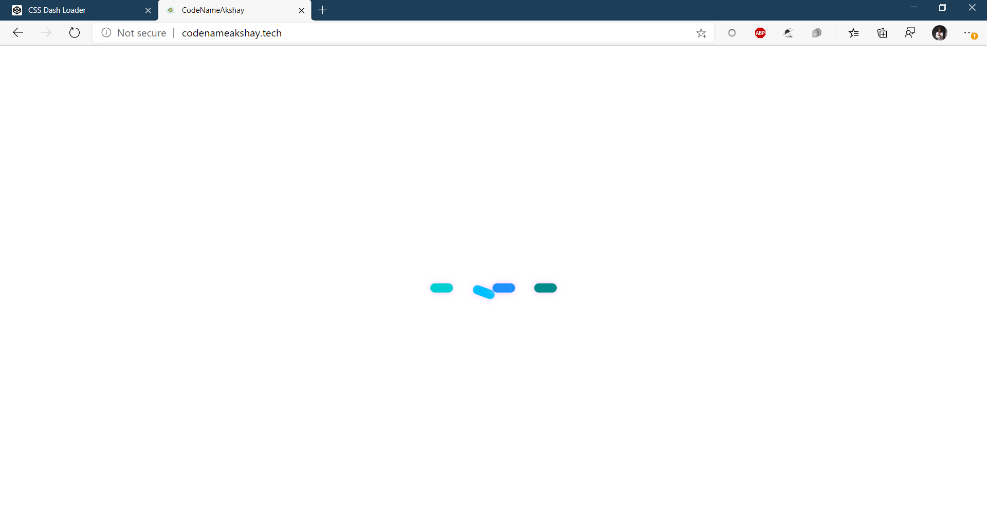
I edited the color of the loader as well as its speed.
<head>
  <style>
.loading {
            display: flex;
            justify-content: center;
            align-items: center;
            background: #000;
            margin: 0;
            position: absolute;
            top: 50%;
            left: 50%;
            -ms-transform: translate(-50%, -50%);
            transform: translate(-50%, -50%);
        }
.container {
  position: absolute;
  top: 50%;
  left: 50%;
  transform: translate(-50%, -50%);
  display: flex;
}

.dash {
  margin: 0 15px;
  width: 35px;
  height: 15px;
  border-radius: 8px;
  box-shadow: 0 0 10px 0 #FECDFF;
}

.uno {
  margin-right: -18px;
  transform-origin: center left;
  background: darkturquoise;
  animation: spin 3s linear infinite;
}

.dos {
  transform-origin: center right;
  background: deepskyblue;
  animation: spin2 3s linear infinite;
  animation-delay: .2s;
}

.tres {
  transform-origin: center right;
  background: dodgerblue;
  animation: spin3 3s linear infinite;
  animation-delay: .3s;
}

.cuatro {
  transform-origin: center right;
  background: darkcyan;
  animation: spin4 3s linear infinite;
  animation-delay: .4s;
}

@keyframes spin {
  0% {
    transform: rotate(0deg);
  }
  25% {
    transform: rotate(360deg);
  }
  30% {
    transform: rotate(370deg);
  }
  35% {
    transform: rotate(360deg);
  }
  100% {
    transform: rotate(360deg);
  }
}

@keyframes spin2 {
  0% {
    transform: rotate(0deg);
  }
  20% {
    transform: rotate(0deg);
  }
  30% {
    transform: rotate(-180deg);
  }
  35% {
    transform: rotate(-190deg);
  }
  40% {
    transform: rotate(-180deg);
  }
  78% {
    transform: rotate(-180deg);
  }
  95% {
    transform: rotate(-360deg);
  }
  98% {
    transform: rotate(-370deg);
  }
  100% {
    transform: rotate(-360deg);
  }
}

@keyframes spin3 {
  0% {
    transform: rotate(0deg);
  }
  27% {
    transform: rotate(0deg);
  }
  40% {
    transform: rotate(180deg);
  }
  45% {
    transform: rotate(190deg);
  }
  50% {
    transform: rotate(180deg);
  }
  62% {
    transform: rotate(180deg);
  }
  75% {
    transform: rotate(360deg);
  }
  80% {
    transform: rotate(370deg);
  }
  85% {
    transform: rotate(360deg);
  }
  100% {
    transform: rotate(360deg);
  }
}

@keyframes spin4 {
  0% {
    transform: rotate(0deg);
  }
  38% {
    transform: rotate(0deg);
  }
  60% {
    transform: rotate(-360deg);
  }
  65% {
    transform: rotate(-370deg);
  }
  75% {
    transform: rotate(-360deg);
  }
  100% {
    transform: rotate(-360deg);
  }
}

  </style>
</head>
Finishing touches
Now that you know how to import any CSS loader to your Flutter website you can try experimenting with different effects and even make your site more interesting by using JS.